Let's take a breather
somori is a unique application that provides a place to track tasks, but also to diffuse and distract yourself if you are in need of a break. It is designed with neurodivergent people in mind.
It started out as a Swift Student Challenge project back in 2024 but became something much bigger than that. It was also the project that lead to most of my growth as a Swift developer.
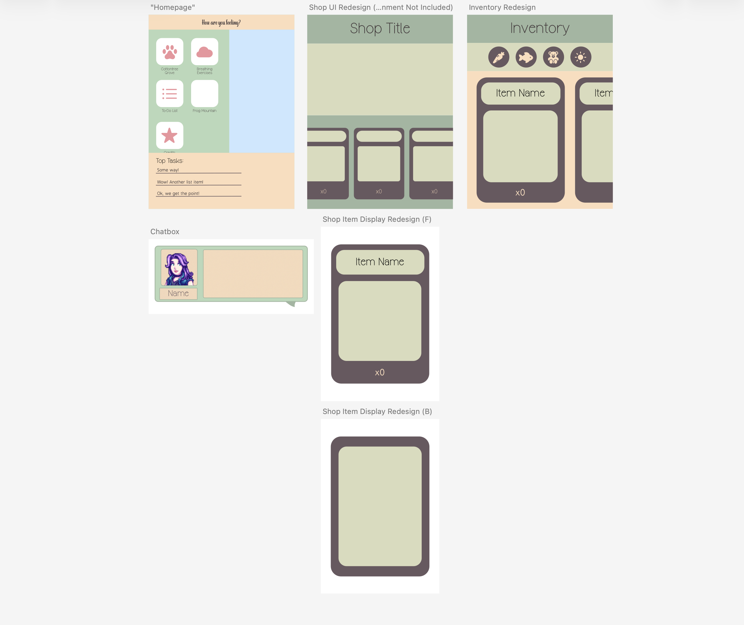
UI Design is always the best part
As usual, I like doing the fun stuff first, which is always the UI design. As a frontend developer, this is almost always what I'm thinking about first.
I wanted the UI to be game-like and unique, but not too overwhelming. Since I was designing this for an iPad, I had a lot more flexibility and space to work with.
The best way to not be overwhelming in UI design is to use as much space as possible with as few things as possible. Sounds a bit counter intuitive, right? But in reality, this means there's much less that the brain needs to be processing. It ends up working in favor of the developer, and also the user. Additionally, since this app is meant for neurodivergent people, it's important to think about what kind of accomodations they might need. The audience is always the most important part.
And then there was the SpriteKit Game
The uniqueness of somori is that there is games built into it. I could have made this app into multiple seperate apps, but the multiple options the user has within it is a part of the core identity of the app. It's meant to be a space for users to be able to relax while also tracking and being reminded of what they need to be doing, after all.
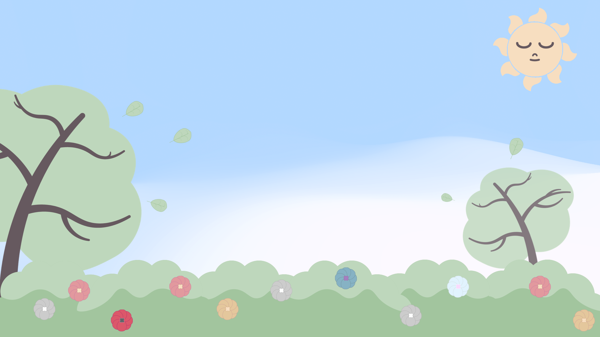
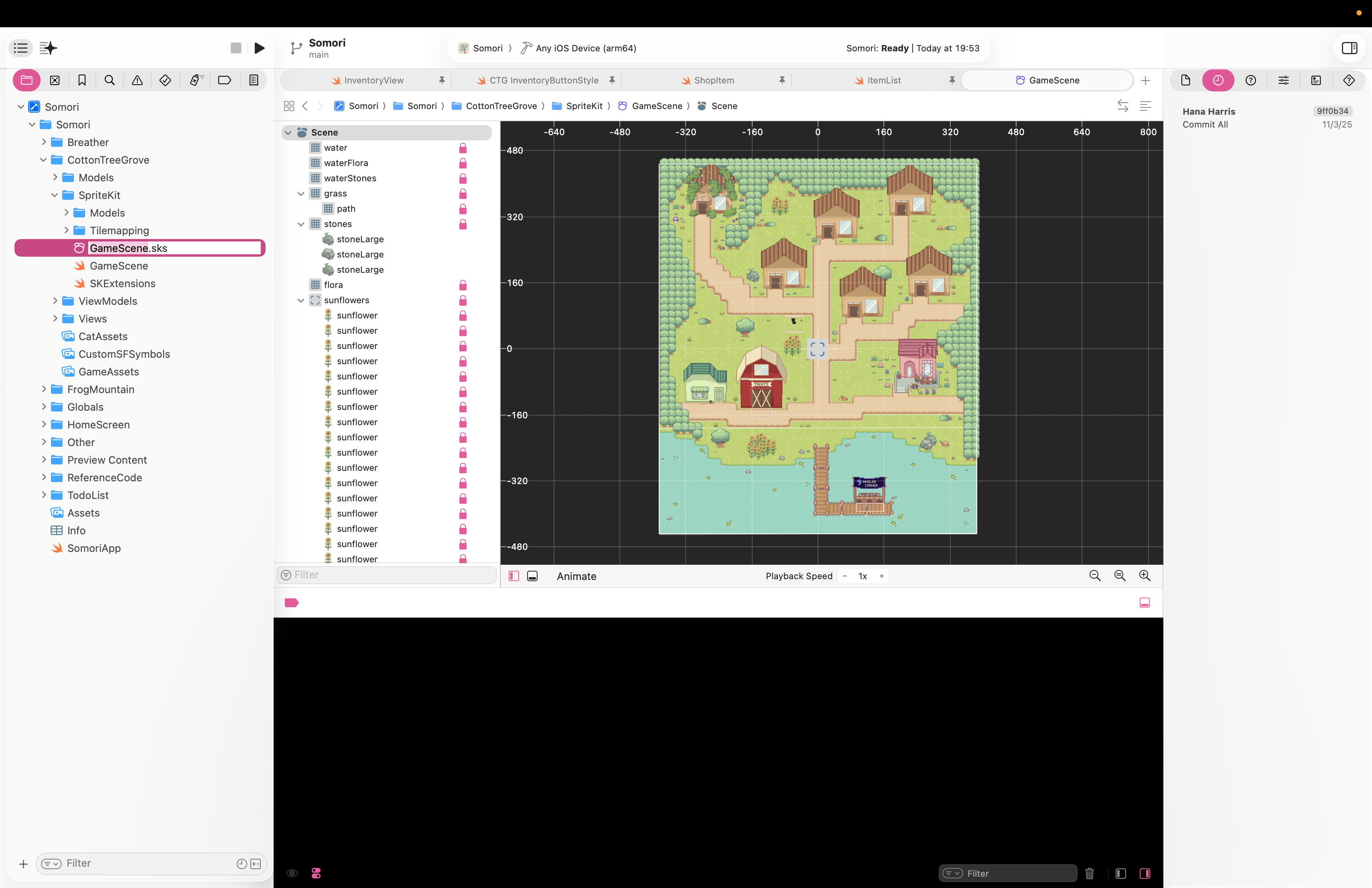
The main game is called Cotton Tree Grove, and it entails a young woman taking care of a stray cat. In order to accomplish this, the player must go to different shops to buy food and toys. It's simple in practice, but it provides a little getaway when the user needs it. It's not meant to take up all the users time.
This was the most extensive part of the development process, mostly because SpriteKit was a completely new concept to me at the time. I was essentially building a RPG engine in Swift, and there was very little reference content on this topic. I was working from pretty much nothing. I'm proud of where I made it, though, and I plan to continue expanding it as I can.
"Let's Learning Pixel Art!"
So, I found a lovely asset pack online for the world of somori, full credits to it's creator on that front, but I needed more assets for the type of game I was going for. So, naturally, it was time to pick up pixel art. I created the main character sprite, as well as the houses and buildings you see in game. This was honestly the most fun part of the app for me. I had a bunch of help from my friend Jacob (From Team Celestial!) and plenty of videos online. I highly suggest getting into pixel art if you're the artsy type. It's so much fun.
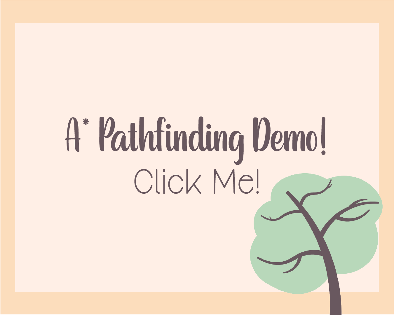
A* Pathfinding
In order to travel the world, you have to be able to walk. In real life, that means thoughtfully putting 1 foot in front of the other, but in a game, what does it mean?
Well, in games, there's plenty of movement control types, like a d-pad, or a joystick. But for me, I wanted neither of these. I wanted the user to be able to tap in order to get the character to go where they want. This turned out to be very difficult to implement, but arguably one of my best feats.
The answer to this question is A* (A-Star) pathfinding. In short, it means telling the computer to ask: "what's the shortest path to my destination. And if there's anything in the way of this path, what should I do? I won't get into the nitty-gritty of it all here, but this concept is very common in pixel art videogames, but not in SpriteKit land. I had to build the entire A* Pathfinding engine from nothing. Here's the result of that."
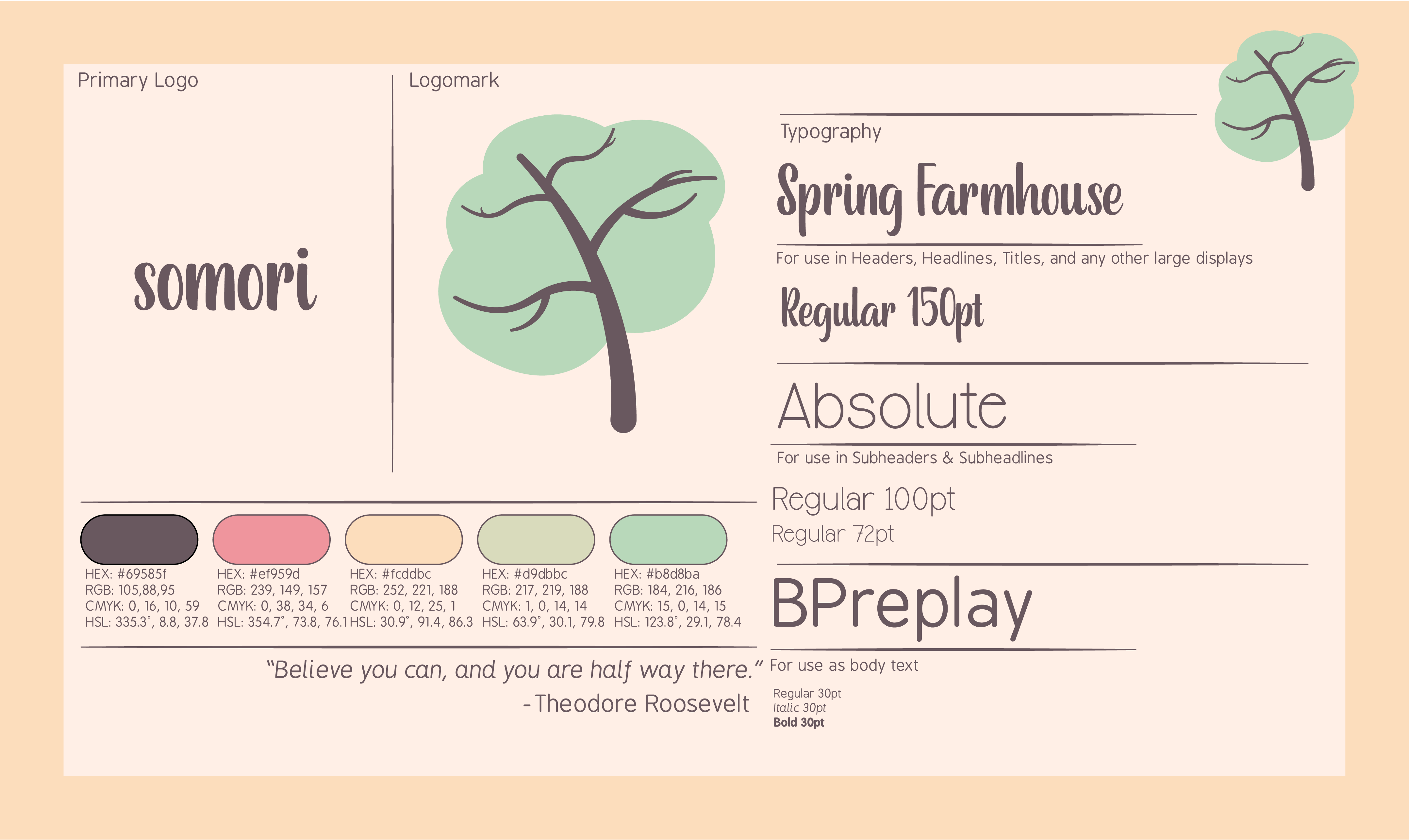
Brand Identity
The brand identity of my projects is, in my opinion, what makes them stand out the most. I desire cohesive color schemes while prioritizing accessibility.
Soft pastel colors was the name of the game here. I landed on the sage green and yellow combo pretty early, and ended up with the brown for most accenting. I like this color palette so much that it shows up in some of my other projects as well, if you look around. Green and yellow is a fantastic choice for calm but fun games. Highly recommended. You can see the full brand style guide to the right.
Where are we now?
Well, this app will likely be one of those projects that I'm always working on in some way. I want to expand the game out with RPG fighting elements in the future, turning it into something like Stardew Valley. That game heavily inspired this one, and SV's developer is one of my absolute favorites, so it only makes sense to pay homage.
To the right, you'll see full usage of the app as it stands. This app will not be available to the public for a while, but maybe in the near future. Who knows. Thanks for reading!